Building Performance Evaluation as a Function of Distance and Time
 As a dedicated health care architect I’ve learned to approach design challenges with the goal of harmonizing requirements that are often diametrically opposed. While the personal needs of the patient may not be conducive to the most efficient operational flows or facilities maintenance processes, the responsibility for defining the highest level of synchronicity possible between base project requirements is something I take very seriously and embrace completely.
As the physical platforms for delivering health care continue to evolve in their complexities and regulated reimbursement costs decline, efficient planning and design become increasingly more important as health care cost control mechanisms. Determining the proper operational and physical relationships of project components can have dramatic and far-reaching impact to the bottom line performance of a facility.
The rigor of Array Architect’s approach to ensure maximized efficiency is illustrated by a recent analysis for a large (approximately 175,000 gross square feet) ambulatory care facility in western Pennsylvania. After the conceptual programming phase of the project, we were asked to evaluate two potential sites for the facility. The first site had a compact size that required the program to be distributed over three floors, while the second allowed a two-story scheme. In order to determine which site would result in the most operationally sustainable facility, we evaluated the micro- and macro-departmental relationships as a function of both distance and time.
In order to assign appropriate importance to departments that were more operationally aligned or more frequently traveled, we developed a functional relationship hierarchy and scaled the number of trips between departments accordingly:
1. A very strong relationship has departments that are adjacent and there is high potential for shared staff and/or patient cross referrals. The trip ratio is eight and trip percent is 53.3 percent.
2. A strong relationship requires departments to be on the same floor. The trip ratio is four and trip percent is 26.6 percent.
3. A moderate relationship includes departments that are convenient, however different floors are acceptable. The trip ratio is two and trip percent is 13.3 percent
4. A weak relationship is one where departments have limited traffic or communication and may be remotely located. The trip ratio is one and trip percent is 6.6 percent.
5. No relationship is one in which there is no communication.
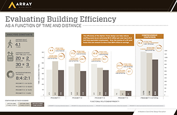
Additional constants that were used in our calculations included the average adult walking speed (4.1 feet per second) and the typical elevator wait and trip time (20 seconds per floor for the two-story design and 30 seconds per floor for the three-story design).
After measuring the distance between building entrances, departmental entrances and vertical transportation points, we converted all data to time in order arrive at a comparable, apples-to-apples data set (for example, a 100-foot travel distance was converted to time by dividing by the 4.1 feet per second walking speed constant). The final step was to weight the data based upon the departmental priority rankings.
The data clearly proved that the two-story scheme resulted in the most efficient building. However, regardless of the information that this type of raw data can convey, we have found that if data isn’t easily understandable it is easy to ignore. The challenge we set for ourselves is to be able to convert complex data into pictures and graphics that legibly and comprehensively fit onto an 11×17 sheet of paper (or an A3 for those speaking in lean language).
Finally, we try to make a quantifiable comparison statement about the data — for this project, saying that one design performed an aggregate of 221 seconds per interdepartmental trip better than another design would have been meaningless, however converting this data to the corresponding 8.3 full-time equivalent employees ($1.2 million in salary) per year and forecasting the $34 million in salary over the course of the anticipated 20-year lease provided our client’s senior administration with building performance metrics in a format that could be used in their fiscal evaluations and decision making processes.
The final presentation of this data is in the illustration above. I believe that the value of infographics like these is in its offering of clarity. When properly and scientifically composed, they can quickly and compellingly convey salient information and relevant data while enabling the quick decision making that is a base requirement of today’s fast moving project schedules. Taking the time to analyze design option data and to skillfully communicate it creates a tangible link between operational constructs, design strategies and performance metrics.
L. Kent Doss, AIA, LEED AP, is a principal with Array Architects.
